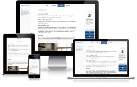
A new year beckons, with all its promise and possibility. I thought I’d welcome in 2015 with a little CSS refresh.
There’s not much in the way of visual difference between this design and its predecessor. Structurally however, it’s a different matter. I’ve reworked the CSS following the mobile-first philosophy and I’ve adopted the flexbox layout model.
I found designing around flexbox an absolute joy. Philip Walton’s “Solved by Flexbox” inspired me to build a “holy grail” layout — flexbox.
Of course, I’m aware that flexbox might not yet be ready for prime-time due to legacy browsers. However, modern browser support is good.1 Furthermore, whilst I was putting it together, I continually checked this website with Safari, Chrome and Firefox on OS X, along with Safari on iOS and have achieved parity across all four.2 Considering my audience, I think this is acceptable.
With flexbox in our toolkit, web-page layout is less frustrating and quicker to implement than it has ever been. Additionally, with CSS Grid Layout support on the horizon,3 the future looks good too.
Here’s to a great 2015. Happy New Year.
-
Of course, your mileage may vary. If you encounter any problems please drop me a quick note: [email protected]. Thank you. ↩︎
 A
A