 Hold the Front Page!
The Perpetual βeta never really had much of a home-page. Before today, a visitor landing at www.perpetual-beta.org would see this:
Hardly the most attractive or welcoming introduction to the website is it?
It always bothered me that the home-page didn’t tell visitors anything about the website, its creator or what to expect within. But I had no idea what to do with it. Oh sure, I tried permutations of a couple of designs, but nothing really hit the spot for me, until today. This is what the home-page looks like at the time of writing:
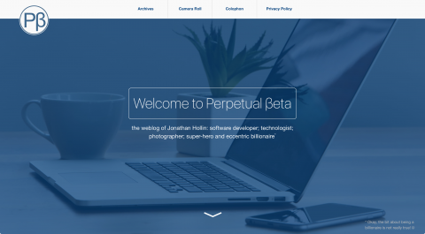
It now features some words about myself, set against a gorgeous, responsive, full-screen image that also tells the visitor I’m something of an Apple fan-boy.
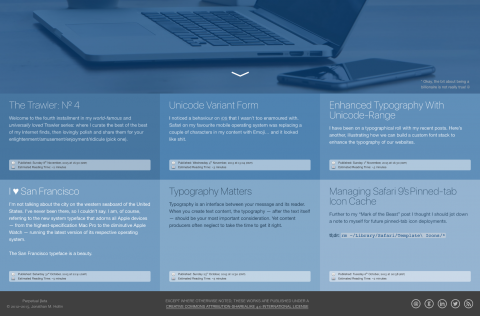
On scrolling down we have a series of tiles promoting the latest posts in the weblog:
I’m much happier with the home-page now. It makes the Perpetual βeta website feel more “complete” to me. I hope you like it too.