Introduction
- Introduction
- The Engine Room: CPU, RAM and SSD
- Force Touch Trackpad
- Keyboard
- Touch Bar
- Touch ID
- Screen
- Thunderbolt 3 / USB-C
- Battery
- Speakers
- Stealth Mac
- Conclusion
When Apple announced the new MacBook Pro, on 27th October 2016, I placed my order immediately. I took delivery of the machine around three or four weeks later. I’ve waited until now to write about it as I wanted to have some time with the computer first. I wanted to build up some real-world experience with it and get a software update or two into the mix to iron out the bugs that I assumed would there (the first version of anything always has issues).
Mine is a BTO 15″ model, with Touch Bar. It has the 2.9GHz quad-core Intel Core i7 processor with Turbo Boost up to 3.8GHz and the Radeon Pro 460 with 4GB memory. I also upgraded the PCIe-based SSD storage to 1TB. I wanted to max out with the 2TB option but that would have taken the price over £4,000 —
Now that I have some time with the new MBP under my belt, I thought I’d write up my notes. My thoughts on this oh-so-controversial machine.
The Engine Room: CPU, RAM and SSD
Unfortunately I didn’t benchmark my previous MBP, with the jobs I regularly perform. So I am unable to offer a side-by-side comparison. I can say that, subjectively, this MBP feels a little faster. But the difference is more, “oh, that’s finished already” rather than “bloody hell, that was fast!” The speed increase doesn’t take my breath away, but is noticeable with some tasks.
For those who care about such things, the Geekbench scores for this configuration are: 4,379 (single core); 13,760 (multi core) and 47,908 OpenCL. Novabench results in a respectable overall score of 1,217.
Therefore, it’s fair to say that processor and GPU performance are (at the time of writing) competitive with other laptops in this rarefied price range.
With the SSD things are much more newsworthy:

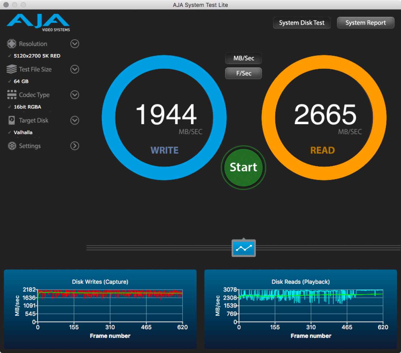
1,944 MB/s write and a massive 2,665 MB/s read speed with a 64GB 5,120 × 2,700 5K RED file. Holy crap. That image says more than anything I could write about this superlative disk sub-system.
Now… let’s talk about RAM. The 16GB upper limit on RAM in this model was widely criticised (myself included). Then I read Jonathan Ździarski’s ‘Can We Put the 16GB “Pro” Myth to Rest?’ and thought, “maybe it’s not so bad.” Having said that, part of me still feels underwhelmed by 16GB. I would have liked to have had at least the option for more RAM. At the same time, I want my laptop to run all day on a single charge. More RAM draws more power and that equals a reduced time on battery. It’s a conundrum.
With the SSD performance of this new MBP we have a lot of leeway with RAM because paging in/out of this SSD is so damn fast. That’s not to excuse the 16GB limit, simply to say that it doesn’t compromise my workflow (and I consider myself to be a “professional” user).
Force Touch Trackpad
The most noticeable aspect of the MacBook Pro’s trackpad is its size. It’s big. My iPhone 6s Plus fits comfortably inside its perimeter. Yet, it doesn’t get in the way. Palm rejection works well (but not perfectly) and I haven’t had any significant issues related to the trackpad’s dimensions.
My previous MacBook had a mechanical trackpad, this one has a Force Touch variant which also features Apple’s “Taptic Engine”. This is my first experience with this technology and I find it impressive. I did not expect it to feel as convincing as it does. The entire trackpad surface is clickable, right into the corners. I could not, through touch, distinguish between a click on my old MacBook and one on the new. It’s impressive stuff. As with all Apple trackpads, it blows the equivalent non-Apple hardware of the water. It’s accurate, responsive, lag-free and the surface texture is nothing short of perfect.
Keyboard
The keyboard has suffered so much criticism that I have to wonder: who of those who condemn it, have actually used it for a sustained period?
I have already written tens of thousands of words on this keyboard and I have found it to be easy to live with. The travel is short, that much is true. But the keys are larger than those of my previous model and they are almost perfectly spaced. Each key is slightly concave, which means my thick fingers more naturally find their centres.1 Best of all is the distinct click each key makes when pressed. I have spent hundreds of pounds on mechanical keyboards in the past to get such a click. I love the positive feedback from this keyboard and find myself typing more assuredly on it than I did on its predecessor, or the wired, full-size Apple keyboard I often used with it.
As with all MacBooks, the keyboard offers variable backlighting. This is user configurable and responsive to ambient light levels. Unlike my previous MacBook, light leakage on this new keyboard is virtually non-existent. This makes the keyboard look just that little bit more premium than before.
The fly in the ointment, albeit a minor one, is the new arrangement of the arrow cluster. The ← and → keys are larger than the previous incarnation, so their height now matches that of the ↑ and ↓ keys combined. It looks prettier but, for one who routinely navigated those keys by touch, aided by their dimensions, it has taken some getting used to.
Oh, and the esc is missing. More on that below. 😀
Touch Bar
The headline feature of the late 2016 MacBooks is undoubtedly the all new Touch Bar. According to Apple:
“The Touch Bar —
located above the keyboard on supported MacBook Pro models — is a Retina display and input device that provides dynamic interface controls for interacting with content on the main screen. These controls offer quick access to system-level and app-specific functionality based on the current context.”
The first thing I noticed about the Touch Bar was that some of the application defaults are weird. Take Safari for example: by default, a scrubber featuring microscopic previews of that browser’s open tabs, occupies the largest portion of the Touch Bar. Now, given that I’ll often work with twenty or more open tabs (and have the eyesight of a man closing in on fifty), this scrubber is almost entirely useless. It may look good in demos and photo-shoots, but that’s about it’s only use.
Fortunately the Touch Bar is highly configurable, even for the macOS stock apps. My customised Safari Touch Bar, for example, is much better suited to my workflow than the eye-candy default.


Therefore, when switching to a Touch Bar MacBook, you should anticipate spending some time configuring it to your particular requirements. The Touch Bar becomes so much more useful when you’ve tweaked it.
It’s worth pointing out that compatibility with the Touch Bar is not universal, yet is growing rapidly. The MAS informs me at least once a week that one app or another has an upgrade that includes support for the Touch Bar. But some older apps, not actively maintained, will likely never offer such an update. However, with a little effort, one can coerce even these incompatible apps to play nice with Apple’s new shiny.
The Touch Bar is a first generation product and it shows. That’s not to say it doesn’t work, it does. What I mean to say is that it needs more work. It’s way too easy to accidentally activate something (the number of times I’ve inadvertently muted audio is beyond counting). I contend that haptic feedback is an absolute must have for the next generation Touch Bar, and the user should be able to choose, in System Preferences, whether it should respond to touch, or to a press (and I’d choose press, every time).
So what about the esc key? You know, the one that’s been on keyboards forever. There was much angst in the user community when it became obvious that Apple would replace the physical esc key with a soft key on the Touch Bar. But, guess what? There is no justification for the apparent panic. The esc is still there, in its usual place —
Touch ID
One of the gems of the late 2016 MacBook is Touch ID. Familiar to iPhone users the world over, Touch ID is a biometric authentication system, with fingerprints as its access key. As with the iPhones, it works flawlessly and is a wonderful, time (and frustration) saving system. When tied in with 1Password, as on my system, it’s perfect for secure authentication with the myriad websites we all interact with on a daily basis.
One of my concerns, before receiving the computer, was how configurable —
I needn’t have worried. Touch ID has a range of options. It provides for a traditional login along with Apple Pay, iTunes and App Store purchases. And, as I mentioned above, third party apps (like 1Password) can use it too.
There are, however, some inconsistencies in its implementation. Some System Preference panes accept Touch ID authentication while others require a traditional password. This is mildly irritating, but I suspect a further software update or two will bring these remaining components in line.
All in all, Touch ID is a positive addition and brings much to the macOS user experience. It speaks volumes that when I use my non-Touch ID Mac in the office, I really notice that it’s missing.
Screen
In addition to the new features, Apple upgraded the display of the late 2016 MacBook. According to Apple, the screen is brighter (up to 500 nits), has 25% more colours than sRGB (wide colour) and a 67% higher contrast ratio than that of the previous generation MBP.
I can’t really see any difference between this and the late 2013 MacBook Pro I have upgraded from. But then, as I wrote earlier, my eyes aren’t what the once were due to presbyopia. I’ll say this, I have no complaints at all about the display.
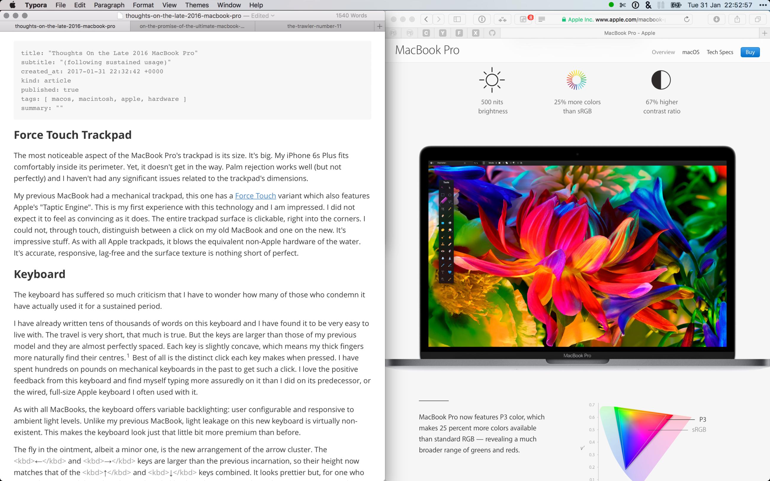
There’s something else: Apple have increased the native resolution/scaling in comparison to my previous MBP. It’s now practical to work with two half-width, adjacent windows on this laptop’s display. Something that never seemed workable on its predecessor.2 This fact alone makes for some serious productivity wins.

Thunderbolt 3 / USB-C
Critics have voiced their disgust at the replacement of all legacy ports with the new Thunderbolt 3 / USB-C ports on this generation of MBP. Back in October, I wrote about my enthusiasm for the new port. After these first months of use, I am happy to report that my zeal hasn’t waned. I can truthfully declare, I am more of an advocate for Thunderbolt 3 / USB-C now than ever before.
Let’s look at the benefits of this mighty port once again:
- Daisy-chain-able;
- Reversible connector;
- Universal (plug anything into any port);
- Bi-directional power on any port;
- Diminutive form factor;
- Two streams of DisplayPort 1.2 video bandwidth per port;
- Up to 100W of power;
- Networking up to 10 Gb/s
- Thunderbolt 3 throughput up to 40 Gb/s
- Backwards compatibility with Thunderbolt 1 and 2 (20 Gb/s), along with USB 2.0, 3.0 (5 Gb/s) and 3.1 (Gen1/Gen2) @ 10 Gb/s
Make no mistake, this is a game-changing, killer interface.
So, what about #donglelife? Well, for myself, it’s been a non-issue thus far. I bought half-a-dozen Nonda MI22SGRN USB 3 → USB-C adapters, which I leave permanently attached to the cables of the devices I connect to my computer.
I have a single dongle attached, a Belkin USB-C to Gigabit Ethernet Adapter (I prefer wired networking where possible). I also used an Ethernet dongle with my previous MBP, so there’s no change here.
I never read SDHC cards via the integrated reader on my previous MBP as I used that slot to extend the storage of the machine. So I have always used either an external reader, or plugged my camera directly into the laptop. In this case, I did end up buying a new card reader. I had to. My old reader plugged directly into the computer and despite the diminutive Nonda adapter, it ended up obstructing the adjacent USB-C port. For good measure, I also threw a Nonda adapter on to my camera’s USB cable. So I have all bases covered.
To charge my Apple TV remote, I bought an Apple USB-C to Lightning cable. To connect my iPhone to the MBP I use an Anker PowerLine+ Lightning Cable with yet another Nonda adapter. My external HDDs: you guessed it, all are on their existing cables with Nonda adapters.
As for external displays. I haven’t as yet used one with this computer. So I’ll address that as and when the need arises.
A final thought on the ports: Apple should have illuminated them (like they did with the Mac Pro). USB-C boasts one of the smallest I/O ports and, in low light, with a space grey computer, they are just about invisible. Also, there should be a larger gap between them. The Nonda has a small footprint, even so, I can’t plug two in side-by-side… and that’s a shame.
Battery
The battery in the new MBP has had a roller-coaster ride in both the mainstream press and the blogosphere. Some have commended it, while others have criticised it. Consumer Reports published their much-discussed review which, for the first time, failed to give a new MBP a “Recommended” status, due to their experiences with MBP battery life:
“The MacBook Pro battery life results were highly inconsistent from one trial to the next.”
“For instance, in a series of three consecutive tests, the 13-inch model with the Touch Bar ran for 16 hours in the first trial, 12.75 hours in the second, and just 3.75 hours in the third. The 13-inch model without the Touch Bar worked for 19.5 hours in one trial but only 4.5 hours in the next. And the numbers for the 15-inch laptop ranged from 18.5 down to 8 hours.”
“Those were just a few of the results; we tested battery life on these laptops repeatedly.”
Apple subsequently released a software update which apparently fixed a bug in the Safari browser that was responsible for the battery issues. Consumer Reports then changed their position on the new MBP to “Recommended.”
The battery in the new MBP is ~25% smaller —
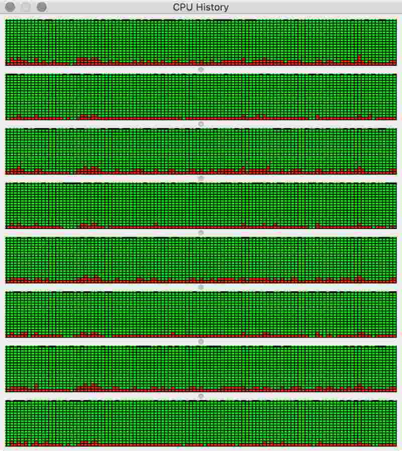
My own experience with battery life on the new MBP reflects this. I’ve run for more than seven hours3 on a single charge with low-energy workloads: web-browsing (with Safari), coding (with Visual Studio Code), writing (with Typora). But then I also have some high-energy tasks that I regularly perform: image processing, machine learning, parallelised number crunching. When I’m running with all eight processor threads maxed-out, I tend to ensure that I have mains connectivity, because I simply wouldn’t expect the battery to provide power for long under such a heavy load.

Speakers
In describing the speakers of the new MBP, Apple tells us that they offer 58% more volume; up to 2.5× louder bass; 3× more peak power and 2× dynamic range, when compared to the previous model. These are mighty claims. All laptop users know that inboard speakers are always a compromise, limited as they are by the physical dimensions of the laptop chassis and the lack of space within.
However, with the new MBP, Apple have raised the bar as to the sound quality you should expect of a laptop. You’re not going to be throwing parties with the MBP as the music source, but you can certainly enjoy music direct from the machine, without using external speakers or headphones.
Stealth Mac
The late 2016 MacBook Pro is a beautiful machine. The 15″ model that I have, seems impossibly thin and light. I know, from Apple’s published metrics, that the computer isn’t that much thinner or lighter than the machine it replaces. But, subjectively, it feels a world away.
In space grey, the computer is discreet. It no longer screams “MacBook!” It no longer draws attention to itself. Unlike other social media commentators, I was happy to see Apple do away with both the illuminated Apple logo on the lid, and the attention-grabbing startup chime.
It is now possible to open and boot the MBP in, say a library, without anybody noticing. It’s almost like having a stealth Mac and I, for one, am happy that Apple made these small changes.
Conclusion
The late 2016 MacBook Pro is a decent laptop. It’s not the fastest machine in its class, but is a solid performer. It’s well built (as far as I can tell) and looks gorgeous. Touch Bar, Touch ID and USB-C / Thunderbolt 3 are respectable new features. The keyboard, trackpad and display are all best-in-class and worthy upgrades from my previous model.
On the flip-side, the computer is massively overpriced. The BTO model I specified came in at an eye-watering £3,329.00. Add in an AppleCare Protection Plan —
That’s a fair chunk of money. I could rationalise such a large expenditure only because I make my living via my computer and the machine occupies a large slice of my spare time too. But I feel a little cheated. I feel like Apple sacrificed too much for the sake of making a thin computer. I would have gladly taken a thicker MBP if it had offered a 99.5 watt-hour battery like its predecessor. Additionally, I would have appreciated an option to upgrade the RAM to 32 or even 64GB (yes, even at Apple’s exorbitant prices).
In general, I expect to get three years of service out of each computer I buy. With the new MBP I know that in twelve months —
I’ll close with this: I’m a loyal Apple customer and have been for more than two decades. This is the first major purchase I’ve made, from Apple, that has left me feeling a little buyer’s remorse. If this computer had cost me £2,700 rather than £3,700 then I’d be raving about what a great machine it is. As it is, it feels like a little “fuck you, suckers” from Apple and I can’t help but feel a little disappointed.
Feedback? Discuss on Hacker News.
-
I think this is new, I’m almost sure the keys on my previous MacBook were flat. ↩︎
-
Even on my previous MBP, I was always able to work with two adjacent panes in my code editor and iTerm, but they were about the only two apps that I was able to realistically work with in this manner. ↩︎
-
Keep in mind that, with the maxed-out processor and GPU, my MBP will draw more power than a stock machine. ↩︎
 Thoughts on the Late 2016 MacBook Pro