Apple’s introduction of version 9 of their Safari web-browser belatedly brought pinned tabs to the browser’s UI. One of the nice features of Apple’s implementation is that the browser doesn’t use a bitmap image for a pinned-tab’s icon. Instead, the Safari developers opted for scalable vector graphics (SVG). Which, in my opinion, is what we should have been using for the favicons family of icons1 from the beginning.
Naturally, wanting to be one of the cool kids, I had to deploy my own pinned-tab icon as soon as possible.2
I fired up my preferred SVG editor —
Deploying a pinned-tab icon is simplicity itself. I uploaded the SVG file to my web-server, then added the following directive inside my website template’s head tags:
<link rel="mask-icon" href="/path/to/pinned-tab_icon.svg" color="#bb0000">
The color property describes the colour Safari will render the icon in when its parent tab is active.
I tested this as soon as my upgrade to El Capitan was complete and it pleased me to discover that everything worked as advertised.
The Snowball Effect
That should have been the end of the matter. But, to my surprise, I found myself liking my new logo. Disappointingly, there was now an inconsistency between my fancy new pinned-tab icon and the rest of the “branding” of the Perpetual βeta.
Or, should I say, lack of branding?
The previous versions of perpetual-beta.org didn’t have a logo as such. The immediate predecessor had this “logo”:

Yes, that’s right, a plain text label. That was fine and it served me well. A text logo is inline to the HTML. So there is no need for an additional request to the server for an image. For the man who obsesses over website performance, it was ideal. But, if I continued to use it, the disparity with the pinned-tab icon would have irritated me too much.
There was something else too… the family of favicons I used bore no resemblance to either the shiny new SVG or the textual logo. Consider this member of my favicon set:

What the heck?
That’s an icon I stole borrowed from a Google Image search back in the day. It bears no relation to the name or content of the website at all. I could have used an image of a cat for my favicon and it would have meant just as much to the Perpetual βeta “brand” as that stupid globe. What on earth was I thinking?
One thing I knew for sure, my SVG logo was reusable.
SVG is ideally suited to the modern, responsive web. It consists of a series of textual instructions that tell the computer how to draw an image. So we can inline it, like my previous textual logo. SVG scales without “jaggies”, so we can resize it to suit a myriad viewports, from mobile upwards. We can style it with CSS, so we are able to repurpose it across redesigns and regardless of media.
It was but the work of a moment to swap out the textual Perpetual βeta logo with it’s SVG successor. I tweaked the positioning and sizing a little, then sat back to admire my handiwork.
But I didn’t like it.
It lacked something. It was too flat, too bland. But hey, as I wrote above, SVGs are style-able with CSS. They also offer another benefit… the filter.
I decided I wanted a subtle letterpress effect on my logo. I experimented with the filter code for hours (I’m new to SVG). I googled, I tweaked, I cried… I broke off and had a nap. But I cracked it eventually.3 Behold, the final version:
This code below is the filter I eventually came up with. I suspect it’s sub-optimal but, as I wrote above, I haven’t much experience with SVG, let alone its filters.
<filter id="letterpress">
  <feOffset dx="-20" dy="-20" />
  <feGaussianBlur stdDeviation="20" result="offset-blur" />
  <feComposite operator="out" in="SourceGraphic" in2="offset-blur" result="inverse" />
  <feFlood flood-color="black" flood-opacity="0.50" result="color" />
  <feComposite operator="in" in="color" in2="inverse" result="shadow" />
  <feComposite operator="over" in="shadow" in2="SourceGraphic" result="inner-shadow" />
  <feFlood flood-color="white" flood-opacity="1.0" result="color" />
  <feOffset result="offOut" in="SourceGraphic" dx="-20" dy="-20" />
  <feComposite operator="in" in="color" in2="offOut" result="shadow" />
  <feComposite in="shadow" in2="SourceGraphic" operator="out" result="outer-shadow" />
  <feComposite in="inner-shadow" in2="outer-shadow" in3="SourceGraphic" operator="over" />
</filter>
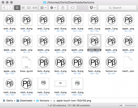
The remaining task, updating my favicon set, was as easy as pie. I uploaded my SVG file to RealFaviconGenerator.net, adjusted the configuration to suit the Perpetual βeta and let her rip. A wait of a second or two yields this:

All that remained was to reference these in my website templates and upload the files to the server.
That was that, my little re-branding exercise is now complete. Now for a nice cup of tea…
-
Think you just need one
favicon.icofile? Think again! ↩︎ -
I deployed in time for the public release of OS X El Capitan, so I was in on the action right from the start! 😃 ↩︎
-
I suspect I would have admitted defeat eventually, had it not been for the inspirational album “Brave” by Marillion, which I played on repeat while I hacked. ↩︎
 The Mark of the Beast